It was always our plan to quietly launch the platform, and then take time in the stands to watch and learn how people react to the service, absorbing both the positive and the negative aspects of Desinion.
This one-month-long learning exercise has taught us many things, and we will excitedly be building out some amazing new, and extremely useful features based on what we have seen, experienced and learned over the last 30 days. In this particular blog post I won’t go into all the details about all the exciting future plans and features we have install, however I do want to share with you news about one very important feature that we are currently working on, and will release soon and that is a ‘More context feature’.
We have read tweets, blog post comments and received your emails on this subject and we 100% agree with all of the comments that suggest that more context is desperately needed when offering your opinions on the design concepts that are laid out in front of you. We also understand that more context on the designs will naturally allow for more informed and relevant decision making when it comes to either giving or getting valued opinions. Adding functionality that allows for more context has now become our number one priority, and it is something that we hope to build out in coming weeks.
We also understand that more context will allow for more informed and relevant decision making when it comes to either giving or getting valued opinions. Adding functionality that allows for more context has now become our number one priority”.
We are always grateful for your suggestions and will always listen to your feedback. It is you, the Desinion community that will shape the future of Desinion. You guys have spoken and we will be delivering.
Please, should you have any further suggestions or comments please do not hesitate to contact us.
Written by Chris Payne (@chrisypayne), Graphic Designer & Founder of Desinion.com ]]>
Watchmaker – Which option do you like more – By Anton
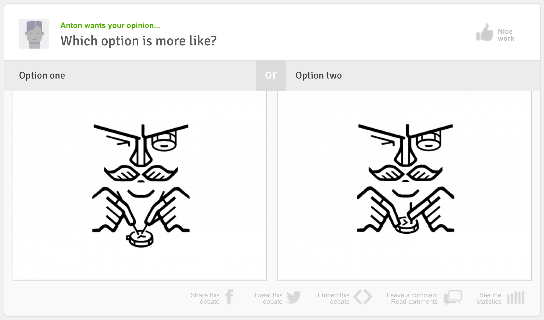
Anton set up a beautiful design debate between two very similar illustrations. Both illustrations showed a watchmaker, delicately and finely performing his craft, the different between them was that opinion one, had the watchmaker holding two pincers with both hands, whilst casting a careful eye on his work, the other design concept, opinion two, showed the mustached watchmaker, equally as concentrated, only this time, he is holding the watch with one hand and working on it with the other. The great thing about this design debate is the simplistic attention to detail. The illustration shows care and precision and that reflects a watchmakers traits.
See the stats or offer your opinion and comments on this design debate here
Diagram – With shadow or without shadow – By Jelle
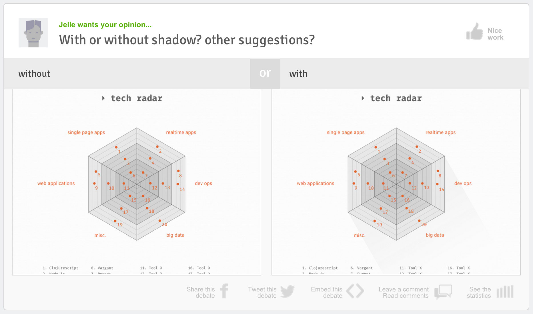
This was the first design debate submitted to Desinion that asked a question about the styling of a diagram. Created by the very talented Jelle, with the aim of finding out which diagram looks better, one with a slight shadow or one without and shadow. The Desinion community offered their opinion and one of these two options was an outstanding choice.
We appreciate how difficult it is to create diagrams that look good, so when this one came up, we instantly liked it for it’s colours, its strong shape, its sharpness and font choices.
See the stats or offer your opinion and comments on this design debate here
Kitchen Table SF secondary logo / badge – By Amy Hood
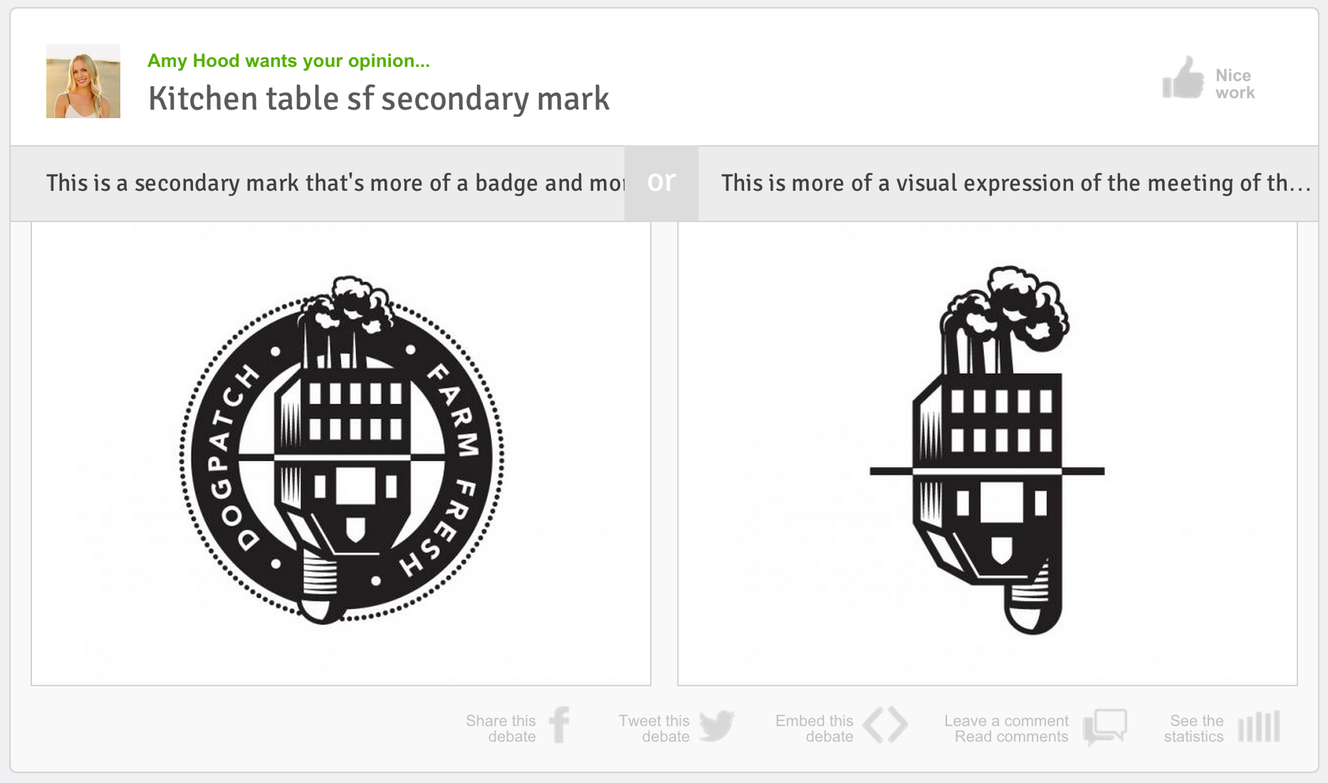
This was Amy Hood’s first design debate, and what a great design debate it was. Amy is from the amazing design agency called Hoodzpah design co (check out their work / attitude, it’s awesome – www.hoodzpahdesign.com), and we are super happy to see her / their work being debated on Desinion.
Amy wanted to test public reaction between two designs that could be Kitchen Table SF’s secondary mark or badge. Option one included a circular band that would encompass the main graphic, and included the words Dogpatch (the area in San Francisco where Kitchen Table SF is located) Farm Fresh. Option two was more simplistic and stripped back, only showing the barn / factory graphic.
Both design concepts are brilliantly stylish, bold, cool and striking. This was a very popular debate that got the Desinion community commenting and offering their opinions.
As it stands with over 100 opinions being offered on these design concepts, one opinion is far more popular than the other.
See the stats or offer your opinion and comments on this design debate here
Chapel Gate Memorials – minimalist vines? or detailed vines – By Nico Encarnacion
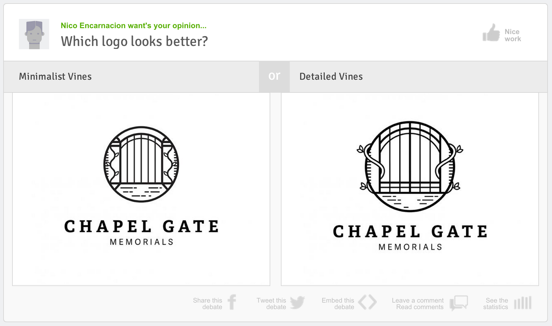
This is Nico Encarnacion’s 3rd design debate, and what a popular design debate it was. Nico created two excellent potential logos for Chapel Gate Memorials, both similar in style, yet had slight differences in the placement of the vines and the position of the gate within the circle.
The debate received a great number of opinions and comments, and of the two options proposed, one was proven to be way more popular than the other.
See the stats or offer your opinion and comments on this design debate here
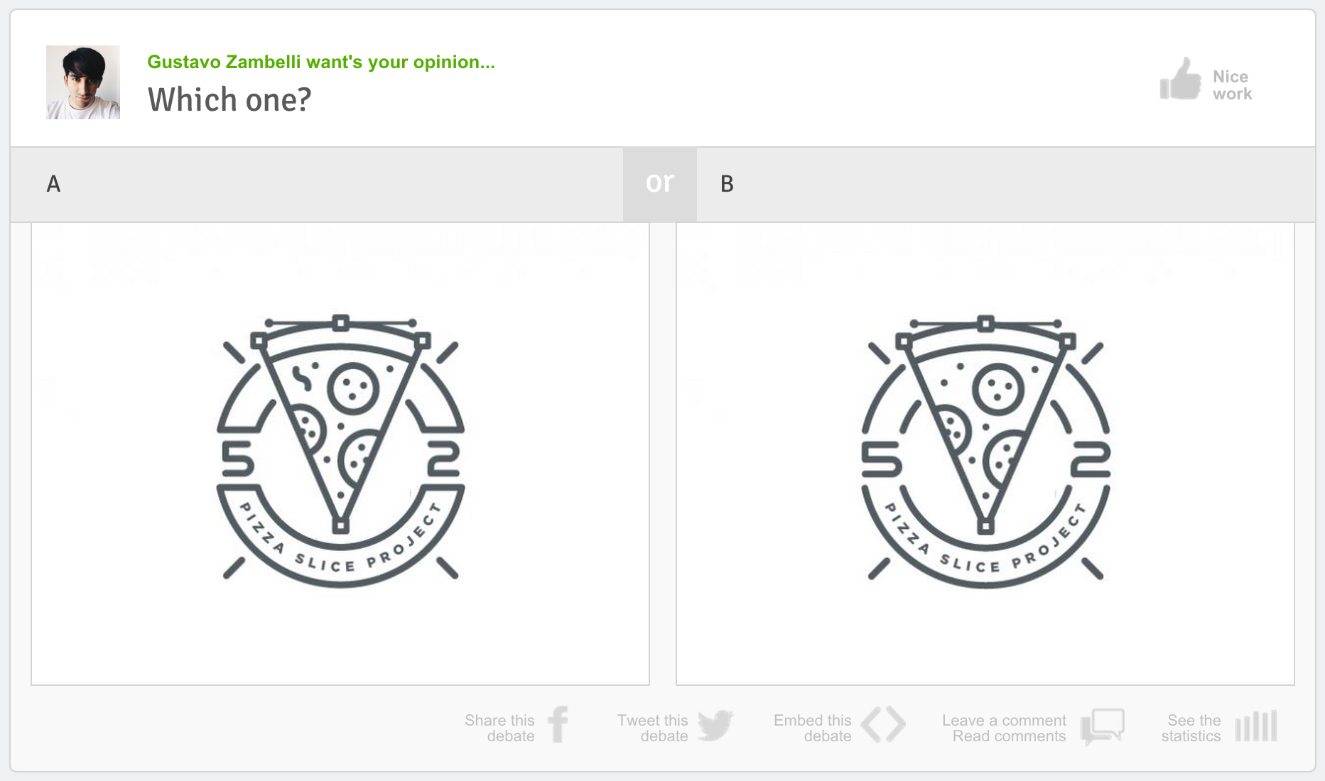
Pixilated Pizza – With edge or without edge? – By Gustavo Zambelli
![]()
We love an intentionally pixilated slice of graphic design. So what better than a pixilated pizza from Gustavo Zambelli who designs for the amazing Ricos Quesos and Aerolab in Argentina.
Gustavo wanted to know which pixilated pizza slice you thought would be better? A slice with a pixilated boarder, or a slice without a pixilated boarder and with a shadow.
Offer your opinion and comments on this design debate here
It has been a great first month for Desinion and the designers / illustrators that have benefitted from getting feedback, comments and statistics on their design concepts. Word has spread pretty far about Desinion, and for that reason we are seeing a large increase in the amount of opinions given on your design concepts. Thank you to all that have created amazing design debate in the past few days. We hope that the feedback you have gotten proves to be useful.
If you are new to Desinion, and would like to offer your opinions on designers design concepts, or maybe you are working on a design or illustration yourself, and would like to get insightful feedback and statistics on your concepts, please feel free to sign up here.
]]>In today’s insight we will now look at 5 of the best design debates that you guys have been offering your opinion on in the last 12 days.
Burgers, which one? – By Carla Corrales
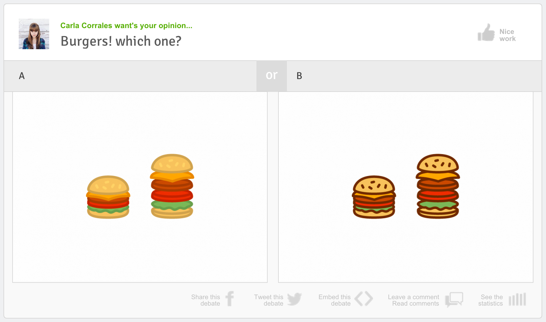
This was Carla Corrales‘ first design debate, and it quickly became one of the most popular and most opinionated design debate of them all. Currently (at the time of writing) this design debate has accumulated the (join) most opinions from a number of different demographics. Carla, who is an extremely talented graphic designer from Buenos Aires, wanted to find out which burger illustration would be more popular amongst different demographics, and she certainly found out. Both male and female decision makers opted quite overwhelmingly for one illustration over the other illustration. – Login or sign up to offer your opinion on Carla’s hunger inducing design debate, and see which burger illustration is proving to be more popular across different demographics.
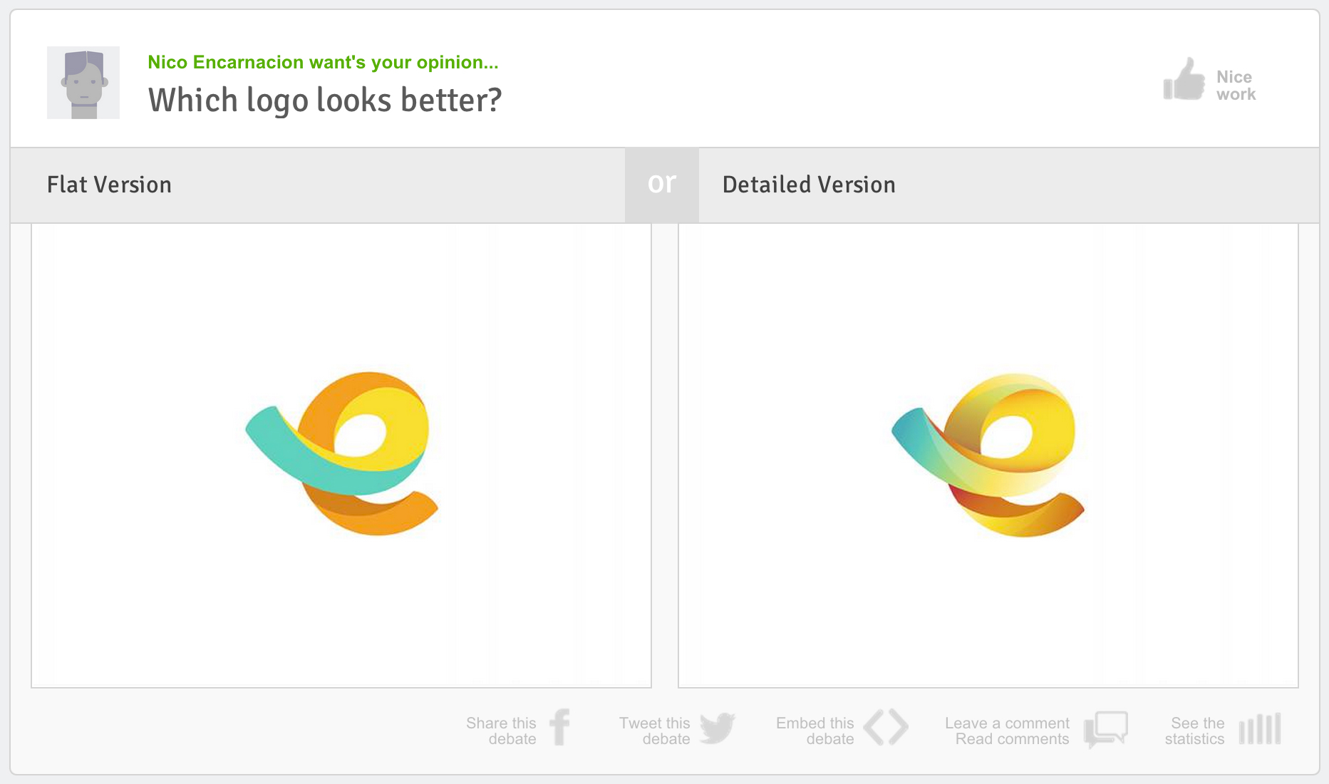
Which logo looks better? – by Nico Encarnacion
The amazing work of Nico Encarnacion was debated on Desinion in this last week. In creating a logo mark, with two varying styles Nico, isn’t only asking the question – Which logo looks better?, but he’s also opening the interesting debate on what is better, or currently more popular – flat graphics?, or detailed graphics?. This was Nico’s first design debate on Desinion, and we hope to see many more design debates from such a talented designer. Opinions on this design debate are, at the time of writing, pretty even, so your opinion counts. – Login or sign up to offer your opinion on Nico’s flat vs detailed, design debate, and see which logo and which style proves to be more popular across different demographics.
(Personal logo) Two options but I need to decide on one? – by Wanda Arca
![]() This was a great design debate, by a very talented designer. Wanda was designing her personal logo, and wanted opinions on which logo would be better received by various audiences. Wanda Arca cleverly combined her initials – Using the full W and the outer part of the A to form this cute, clever and personalised logo. Wanda shows great use and control of gradients in both logo concepts, which help to distinguish between the W and the A. Gavin Williams commented on Wanda’s design debate saying – “Modestly beautiful, clever and subtle. It took me a little while to spot the ‘A’ within, but for me that makes it a sweet surprise.” – Login or sign up to offer your opinion on Wanda’s personal logo, and find out which concept is proving to be more popular with different audiences.
This was a great design debate, by a very talented designer. Wanda was designing her personal logo, and wanted opinions on which logo would be better received by various audiences. Wanda Arca cleverly combined her initials – Using the full W and the outer part of the A to form this cute, clever and personalised logo. Wanda shows great use and control of gradients in both logo concepts, which help to distinguish between the W and the A. Gavin Williams commented on Wanda’s design debate saying – “Modestly beautiful, clever and subtle. It took me a little while to spot the ‘A’ within, but for me that makes it a sweet surprise.” – Login or sign up to offer your opinion on Wanda’s personal logo, and find out which concept is proving to be more popular with different audiences.
Which one? by Gustavo Zambelli
This design debate was very popular with the Desinion Community. Although the differences between the two design concepts don’t immediately jump out at you, they do do make a difference to the overall direction of the design. The very talented illustrator, Gustavo Zambelli wanted feedback on the circle, or plate that goes behind the pizza slice, and the numbers 5 and 2. Do you prefer the plate to have an edge when the plate meets 5 and 2? or would the lines that form the plate, simply stop and then restart around the numbers 5 and 2? This design debate split opinion, with both design concepts being equally well executed. – Login or sign up to offer your opinion on Gustavo’s pizza project debate, and find out which concept is proving to be more popular with different pizza eating audiences.
Which town / city scene do you prefer? – by Rita Quintela
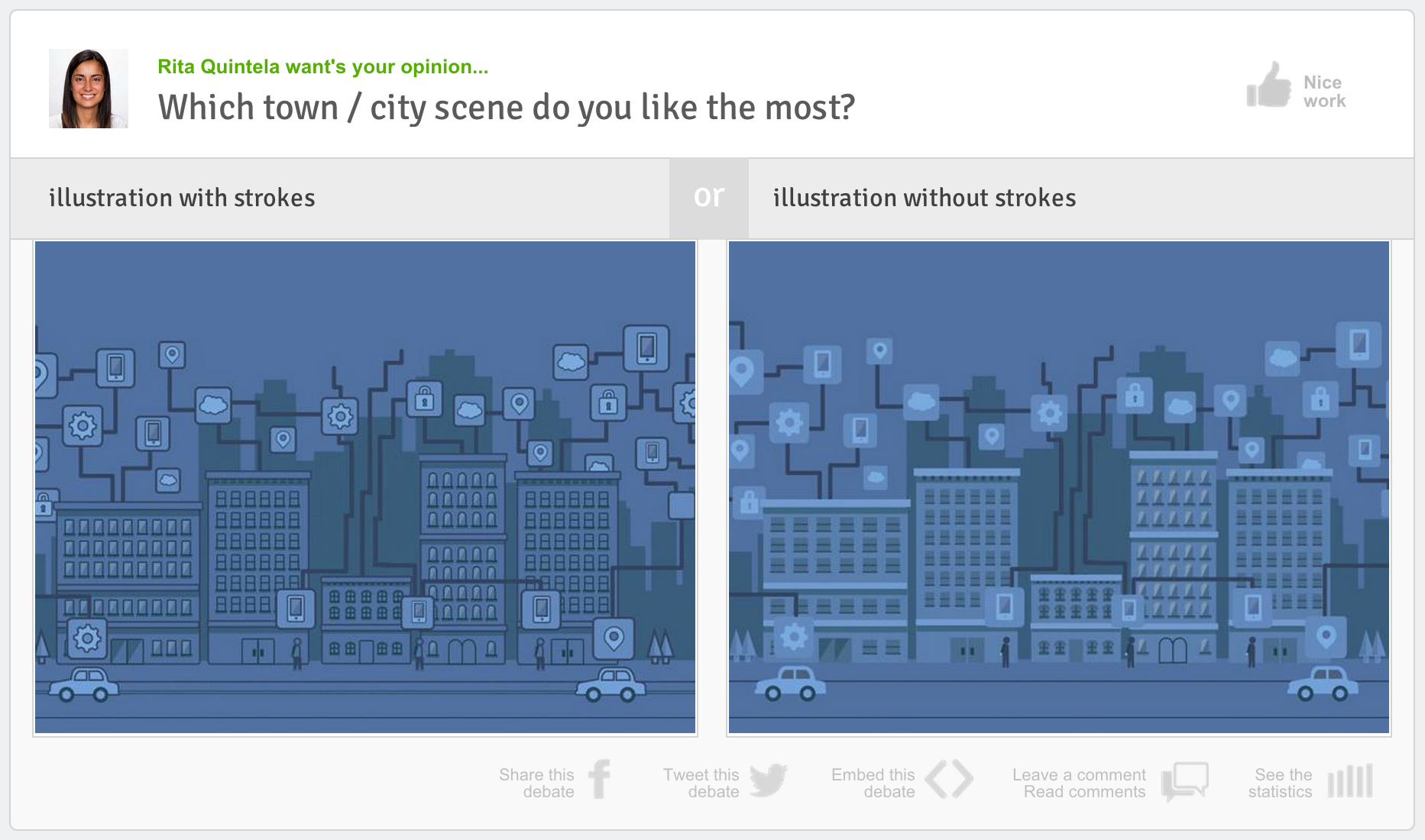 Rita Quintela’s illustration got a lot of attention in these past 12 days. Rita, one of the first to post per work on Desinion, was experimenting with her illustration style. Would her graphical elements which make up her city scene have an outline? Or will they be produced without an outline? One certainly stands out more than the other, where as, it could be said that one of these has a softer less intrusive feel. Which one do you prefer? – Login or sign up to offer your opinion on Rita’s design debate, and find out which concept is proving to be more popular with different audiences.
It has been a great opening few days for Desinion and the designers / illustrators that have benefitted from getting feedback, comments and statistic on their design concepts. As words spreads about desinion, we expect even more opinions to be offered on new design debates on a daily basis as well as in the coming weeks.
If you are new to Desinion, and would like to offer your opinions on design concepts, or many you are working on a design or illustration yourself, and would like to get some feedback and statistics on it, please feel free to sign up here.
]]>It would be fair to say that most good designers have their own personal website or blog or a combination of the two. The personal portfolio websites that designers have are their very own unique piece of the internet. It is their own corner of the world where they can be seen by showcasing their skills, share their opinions and get offered jobs based on their work.
If you have your own website or blog, it would be fair to assume that you have an appreciative group of followers who admire your work and your musings on design. Theses followers love an update from you. It’s like the next chapter of your mind / work being released. The people who read your blog posts or return back to your website obviously appreciate your work, your ideas and your design thoughts.
Followers love an update from you. It’s like the next chapter of your mind / work being released. The people who read your blog posts or return back to your website obviously appreciate your work, your ideas and your design thoughts.
With Desinion you can enhance that experience for your loyal followers and other visitors to your site. You can allow these people who regularly check out your blog to see your latest designs, to be an active part of your design process, in a way that has not been so easy to do… until now. You can do this by embedding your design debate into your personal website or blog.
Embedding your design debate on your blog or website is simple and easy, and it allows you to gain more feedback, statistics and comments on your designs, as well as making your website or blog more inviting and interactive for your users.
Your fans and visitors to your site will appreciate being able to firstly get a sneak preview into what you are working on, and secondly are able to actively participate in your design process by offering their opinion. They will feel valued and keep returning to your website or blog to see if there are more debates that they can offer their opinions on. They will also tweet, like and share what you are working on, meaning that you and your website and the stuff that you are working on will get loads more exposure.
How to embed your work in your blog or website
1 – Click on the ‘Embed this debate’ link (It’s just below the 2nd design concept).
2 – A box will appear with come code in it. That code is unique to the design debate that you want to embed – Select and copy that code.
3 – Paste the code into your page inside the body element, remember to paste this code wherever you want the Design Debate to be displayed on your website or blog post.
4 – Done – Republish or upload your website or blog and it will appear seamlessly for your followers to interact with.
]]>
What is Desinion?
Desinion is a new and unique tool that assists two types of people involved in the design process: the first being those who play with pixels on screen and introduce ink to paper to create beautiful designs; and the second being those that have the responsibility of deciding the best design to use. In short Desinion is an online tool that helps designers and decision-makers gauge an audience’s reaction to their designs concepts and experimentations. Desinion helps designers and decision-makers find out which design concept resonates best with their intended target audience (and other audiences).
This then gives the designer the unforeseen responses and feedback, and therefore helps them see which of their design concepts resonates best with which audience.
Designers simply upload their design concepts to Desinion and ask the community a relevant question about the two options, thus allowing honest and direct answers. These answers are then broken down into demographically defined metrics that enable the designer to easily analyze the relevant statistics received for their design concepts. This then gives the designer the unforeseen responses and feedback, and therefore helps them see which of their design concepts resonates best with which audience.
The best way to get to know Desinion and what is does, is simply to sign up with a free account. Then dive in and start uploading your design concepts and see what the community has to say about your creations. Whilst at the same time you can browse through the existing design debates and gain some inspiration or provide your own educated feedback.
Where the idea came from?
The idea for Desinion came about, when I was briefed to work on an illustration project alongside a fellow designer. We both received the same creative brief, but we were having a series of tense disagreements about which style of illustration would be more relevant and appealing to the audience. We constantly went back to the brief, however we still had different interpretations of what that meant: I believed that the target audience in question – mature and technical savvy -would react better to sharp, crisp and technical illustrations; whereas my colleague believed that the audience would react more positively to illustrations which were more playful, flat-styled, with rounded corners. Our two conflicting opinions caused unnecessary tension which emanated to the final client presentation, in which the client had to make a ‘gut feeling’ decision as to which was more suitable.
We then decided to print the two design options onto a piece of paper and carry out a quick straw poll by passing it around the office. This would help us to see which design style our colleagues thought would be better suited to the target audience, and although my design style came out on top, I remember thinking to myself that there must be a better way to evaluate and test design styles. This led me to start to think about creating something to rectify this extremely common problem in the design process.
I wanted to create something which would be more direct, and that would be of benefit to the designer. Something which would assist the process of design. Something interesting which would provide the designer and the decision-maker with metrics, comments and statistics on their work.
I did my research to see what other design feedback sites existed, and found some amazing sites such as Dribbble, and Behance, which are a great source of inspiration for designers. I thought however that their feedback section was generally too tame, almost too nice. Most comments provided for the designs went along the lines of “Great work”, “Nice job”, “Love this”, and although these comments where fully deserved (as the work on these sites is of a very high standard), I wanted to create something which would be more direct, and that would be of benefit to the designer. Something which would assist the process of design. Something interesting which would provide the designer and the decision-maker with metrics, comments and statistics on their work. Something which designers could use in their client presentations to either prove a point, back up their original hunch or show an interesting insight on their designs. And so, from that the idea for Desinion was born.
From being a little idea in my head, to becoming reality
I instantly knew what I wanted to create. I wanted a place where designers could upload their design concepts and ask a question about them, just like you would if you were doing a straw poll around the office. The key area which would make this place interesting would be the statistics and analytical part. I knew that getting statistics and metrics on design concepts would firstly be fun, and secondly extremely interesting and useful for a designer. I know this from personal experience as, being a graphic designer myself, I love the thrill of putting my creations out there, online and in the public gallery, and seeing what type of reaction they receive. I loved the idea of presenting and receiving statistics on my design pieces, not only general statistics, but also statistics which you could break down and analyze. For the first time, as a designer you could see if your beautiful creations resonate better with a male or female audience; 20-30 year olds or 50-60 year olds; business owners or freelances. I knew that the statistical analysis part of Desinion would be the heartbeat and core of the service.
I also knew that design critique isn’t always about quick answers, it’s also a conversation. I didn’t want to take away the design conversation, so with that in mind I knew it would be important for designers and design enthusiasts to be able to make comments and elaborate further on their answers.
I also knew that design critique isn’t always about quick answers, it’s also a conversation. I didn’t want to take away the design conversation, so with that in mind I knew it would be important for designers and design enthusiasts to be able to make comments and elaborate further on their answers. So after the stats were set up, the next thing to create was Desinion Comments: a neat and tidy comments forum within the design debate. I love this feature; not only can users offer further insights into why they opted for one design over another, but also other Desinion users can agree or disagree with their comments and other comments that have been made. This means that the forum is self-regulating and therefore users can get a great sense of what is good feedback and what isn’t.
So, I hired an amazing developer (not easy to find), and we got to work building this thing!
After a few amazing months of design and development, we had built the basics of the product. Visitors could create accounts and upload their design concepts, and other users could offer their opinions through Desinion Comments (which would be converted into statistics). We were all set. A good for market prototype was complete. At this point we considered launching, but we didn’t, we decided to wait.
Waiting was a tough thing to do, as we were so excited about this product and could see the need for it in our everyday jobs. We just wanted to get the product out there. Our excitement about this product fuelled our creativity. We had a number of great features in mind that we wanted to develop. Features that would enhance the overall Desinion experience and add more value to the user. An example of this was a feature called Desinion Reports. This feature is an amazing way to bring all of the results of the design debate together. Designers can download official and conclusive reports on their designs, so next time they have to present their design concepts to their clients or decision-maker, they can come prepared with automatically generated concise analytical feedback and statistics on their designs.
We also created the functionality to create private debates, so that designers who are working with clients who may not want their design concepts to be publicly viewed, can get opinions and statistics privately, from a chosen group of people, easily achieved through password protection.
With all of these value adding features in place. We now feel that the time is right to launch Desinion. We have many more benefits that we are currently developing, but for now we hope that you enjoy the Desinion experience. We are confident that it will be an extremely beneficial tool that you can use regularly in your design and decision-making process.
Please sign up for Desinion and let me know your thoughts!
Sign up – www.desinion.com/user/pricing
]]>